Note
Click here to download the full example code
Regression analysis
What you’ll learn: Perform a simple linear regression to find a linear relationship between a continuous behavioral variable and resting state functional connectivity matrices.
Author: Dhaif BEKHA
Retrieve the example dataset
In this example, we will work directly on a pre-computed dictionary, that contain two set of connectivity matrices, from two different groups. The first group, called controls is a set of connectivity matrices from healthy seven years old children, and the second group called patients, is a set of connectivity matrices from seven years old children who have suffered a stroke. You can download the dictionary use in this example here. In this example we will perform a regression analysis on a continuous variable. You can also download a table , containing one behavioral variable for all subject in the patients group.
Module import
import pandas as pd
from pathlib import Path
import os
from conpagnon.utils.folders_and_files_management import load_object
from conpagnon.connectivity_statistics.parametric_tests import linear_regression
from conpagnon.data_handling import atlas
from conpagnon.plotting.display import plot_matrix
import numpy as np
import matplotlib.pyplot as plt
from seaborn import lmplot
Load data, and set Path
We will perform a regression analysis and in this case we aim to find a linear relationship between the functional connectivity and a continuous variable, which is traditionally a score measuring an individual performance for a particular cognitive task. In our case, for this simple example, this score will be interpreted as the mean performance for a battery of sub-test regarding the language function.
# Fetch the path of the home directory
home_directory = str(Path.home())

# Load the dictionary containing the connectivity matrices
subjects_connectivity_matrices = load_object(
    full_path_to_object=os.path.join(home_directory, 'raw_subjects_connectivity_matrices.pkl'))

# Load the data table
regression_data_path = os.path.join(home_directory, 'regression_data.xlsx')
regression_data_table = pd.read_excel(regression_data_path)

# Print the data table
print(regression_data_table.to_markdown())
Out:
|    | subjects       |   language_performance |
|---:|:---------------|-----------------------:|
|  0 | sub04_rc110343 |               1.00484  |
|  1 | sub06_ml110125 |               3.83867  |
|  2 | sub07_lc110496 |              -0.907201 |
|  3 | sub08_jl110342 |              -4.26892  |
|  4 | sub10_dl120547 |              -0.957913 |
|  5 | sub12_ab110489 |               3.21885  |
|  6 | sub13_vl110480 |              -0.331407 |
|  7 | sub14_rs120006 |              -1.05699  |
|  8 | sub17_eb120007 |               2.88928  |
|  9 | sub20_hd120032 |              -5.33207  |
| 10 | sub21_yg120001 |              -1.56495  |
| 11 | sub23_lf120459 |               3.80515  |
| 12 | sub24_ed110159 |             -10.4086   |
| 13 | sub25_ec110149 |               1.78148  |
| 14 | sub26_as110192 |              -3.93445  |
| 15 | sub30_zp130008 |               1.42485  |
| 16 | sub32_mp130025 |              -1.2626   |
| 17 | sub34_jc130100 |               1.37514  |
| 18 | sub35_gc130101 |               3.66906  |
| 19 | sub37_la130266 |               3.77187  |
| 20 | sub38_mv130274 |               2.17901  |
| 21 | sub39_ya130305 |               1.08922  |
| 22 | sub41_sa130332 |               1.80184  |
| 23 | sub43_mc130373 |               2.01819  |
| 24 | sub44_av130474 |              -3.84236  |
Important
In order to use the regression function in ConPagnon and some other function, the table need to follow one basic rule: there must be one column named subjects containing the same subject name you use in your data dictionary. The simple reason for that, is when we will perform the regression, we will math the connectivity matrix for a subject with the behavioral score for that same subject. In order to do that, we must have id’s column to fetch the right data. Finally, for this example only, the data should be in the .xlsx format.
As you may notice, we have 27 subjects in the patients group, but we have only 25 entries in the date table. Traditionally, in a linear regression, we simply drop the subjects, discarding their entire connectivity matrix. In the regression function we use next, we will have the possibility to drop void entries.
Compute the linear regression
We can now compute the regression calling the
conpagnon.connectivity_statistics.parametric_tests.linear_regression() function. This function
is very convenient because we give the entire subjects connectivity matrices dictionary as an input. The equation
for this example is very simple :
\(Functional Connectivity = \beta_0 + \beta_1*LanguagePerformance + \mu\),
where \(\mu\sim N\left(0,\Sigma\right).\)
# Call the regression function
results_dictionary, design_matrix, true_connectivity, fitted_connectivity_vec, \
    subjects_list = linear_regression(connectivity_data=subjects_connectivity_matrices['patients'],
                                      data=regression_data_path,
                                      formula='language_performance',
                                      NA_action='drop',
                                      kind='correlation',
                                      vectorize=True,
                                      discard_diagonal=False,
                                      sheetname=0)
As you notice we store the result in a dictionary as usual, here the variable
results_dictionary, contains a sub-dictionary of results for each correction
method you choose. Here, we only apply a False Discovery Rate correction, so there is
only one entry to the results dictionary, results_dictionary['fdr_bh']. For convenience,
there is an entry for each variable in your model. For example to explore the results
associated with the language performance variable, you can access it with
results_dictionary['fdr_bh']['results']['language_performance'].
We only compute the linear regression for the correlation metric, but you can off course explore in what the result differ if you use other metric like partial correlation or, tangent.
# Explore the available results for the language performance:
print(results_dictionary['fdr_bh']['results']['language_performance'].keys())
Out:
dict_keys(['raw pvalues', 'raw tvalues', 'corrected pvalues', 'significant tvalues'])
As you can see, we store the uncorrected p-values matrix, the corrected p-values matrix, the t-values matrix, and the thresholded t-values matrix at the corresponding Type I error rate. We can also retrieve the design matrix of the model, containing the intercept (column of one) and the language score we regressed.
# The design matrix storing the model
print(design_matrix.to_markdown())
Out:
| subjects       |   Intercept |   language_performance |
|:---------------|------------:|-----------------------:|
| sub43_mc130373 |           1 |               2.01819  |
| sub30_zp130008 |           1 |               1.42485  |
| sub38_mv130274 |           1 |               2.17901  |
| sub32_mp130025 |           1 |              -1.2626   |
| sub37_la130266 |           1 |               3.77187  |
| sub14_rs120006 |           1 |              -1.05699  |
| sub04_rc110343 |           1 |               1.00484  |
| sub25_ec110149 |           1 |               1.78148  |
| sub41_sa130332 |           1 |               1.80184  |
| sub20_hd120032 |           1 |              -5.33207  |
| sub35_gc130101 |           1 |               3.66906  |
| sub07_lc110496 |           1 |              -0.907201 |
| sub17_eb120007 |           1 |               2.88928  |
| sub34_jc130100 |           1 |               1.37514  |
| sub23_lf120459 |           1 |               3.80515  |
| sub26_as110192 |           1 |              -3.93445  |
| sub08_jl110342 |           1 |              -4.26892  |
| sub13_vl110480 |           1 |              -0.331407 |
| sub12_ab110489 |           1 |               3.21885  |
| sub44_av130474 |           1 |              -3.84236  |
| sub10_dl120547 |           1 |              -0.957913 |
| sub06_ml110125 |           1 |               3.83867  |
| sub24_ed110159 |           1 |             -10.4086   |
| sub21_yg120001 |           1 |              -1.56495  |
| sub39_ya130305 |           1 |               1.08922  |
Retrieve significant results
From the results_dictionary we can fetch pretty easily the different
regions statistically significant. For example, we can first compute
the indices corresponding to those regions. For simplicity purpose,
we will plot the regression curve for only one couple of regions.
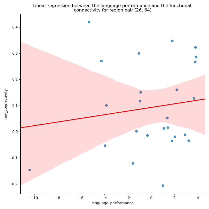
# Find the indices of significant regions of interest
i, j = np.where(results_dictionary['fdr_bh']['results']['language_performance']['corrected pvalues'] < 0.05)
# Fetch the functional connectivity for the one couple of regions
# from the subject connectivity matrices dictionary
roi_i, roi_j = i[70], j[70]
raw_connectivity = np.array([subjects_connectivity_matrices['patients'][s]['correlation'][roi_i, roi_j]
                             for s in subjects_list])
The fitted_connectivity_vec output from the linear regression
function is a matrix of shape (25, 2628), that mean, all the
subjects connectivity matrices are stacked and vectorized on top
of each other. For a quick rebuild of the stack of connectivity matrices,
you can call the conpagnon.utils.array_operation.array_rebuilder() function.
We can now plot the results for the couple of regions we fetched.
lmplot(x='language_performance',
       y='raw_connectivity',
       data=pd.DataFrame({'language_performance': np.array(regression_data_table['language_performance']),
                          'raw_connectivity': raw_connectivity}),
       line_kws={'color': 'red'}, height=8)
plt.title('Linear regression between the language performance and the functional \n'
          'connectivity for region pair ({}, {})'.format(roi_i, roi_j))
plt.tight_layout()
plt.show()
Out:
/media/dhaif/Samsung_T5/Work/Programs/ConPagnon/examples/03_Basic_Statistical_Analyses/plot_linear_regression.py:168: UserWarning: Matplotlib is currently using agg, which is a non-GUI backend, so cannot show the figure.
  plt.show()
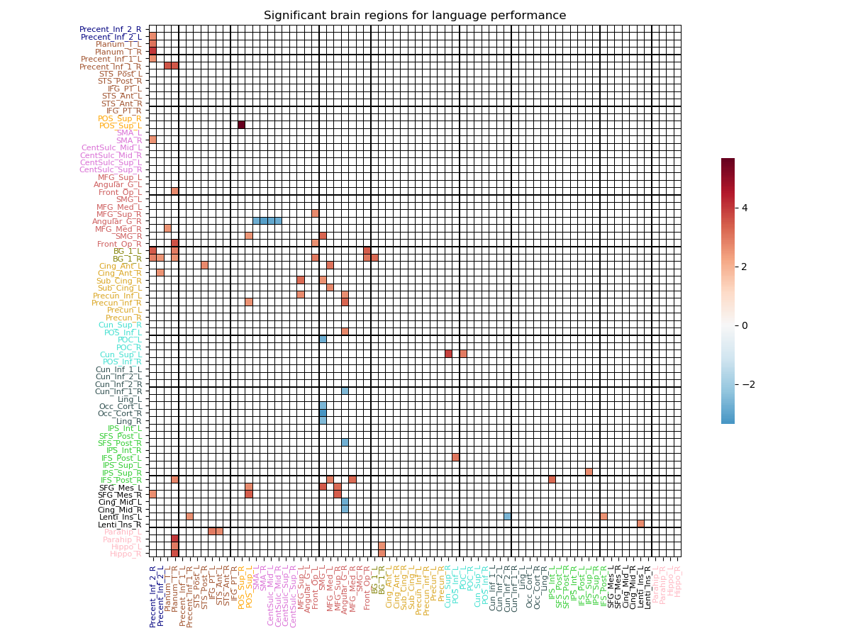
It can be tedious to plot all the significant graph corresponding to significant couple of regions. We have a much more global view of the results if we plot the results in a matrix fashion, and have a grasp of all regions involved in the linear model we currently study. In the newt section below, you lean to plot the results in a connectivity matrix structure.
View the results in a matrix
We can view the results in a global way, by plotting them in a matrix. Each row, and each column correspond to the atlas region you computed your connectivity matrices with, but this time, you will find t-values instead of connectivity coefficient. For plotting purposes only we will use in this section, the atlas we already manipulate in the very first section of the tutorials. You can download the atlas, and the corresponding labels for each regions. This atlas have 72 regions of interest, and connectivity matrices were computed using this same atlas.
Warning
All those files, as a reminder, should be in your home directory.
# First, we will load the atlas, and fetching
# in particular, the regions name, the
# colors of each network in the atlas.

# Filename of the atlas file.
atlas_file_name = 'atlas.nii'
# Full path to atlas labels file
atlas_label_file = os.path.join(home_directory, 'atlas_labels.csv')
# Set the colors of the twelves network in the atlas
colors = ['navy', 'sienna', 'orange', 'orchid', 'indianred', 'olive',
          'goldenrod', 'turquoise', 'darkslategray', 'limegreen', 'black',
          'lightpink']
# Number of regions in each of the network
networks = [2, 10, 2, 6, 10, 2, 8, 6, 8, 8, 6, 4]
# We can call fetch_atlas to retrieve useful information about the atlas
atlas_nodes, labels_regions, labels_colors, n_nodes = atlas.fetch_atlas(
    atlas_folder=home_directory,
    atlas_name=atlas_file_name,
    network_regions_number=networks,
    colors_labels=colors,
    labels=atlas_label_file,
    normalize_colors=True)
Note
Remember that you can generate random colors,
if you can’t attribute to each regions a functional
network. Please see the docstring
of the conpagnon.data_handling.atlas class.
# Now, we can fetch the t-value matrix, thresholded
# at the alpha level (.O5), plotting only the t-value
# corresponding to statically significant brain regions
significant_t_value_matrix = results_dictionary['fdr_bh']['results']['language_performance']['significant tvalues']

# Plot of the t-value matrix
plot_matrix(matrix=significant_t_value_matrix,
            labels_colors=labels_colors,
            vertical_labels=labels_regions,
            horizontal_labels=labels_regions,
            linecolor='black',
            linewidths=.1,
            title='Significant brain regions for language performance')
plt.show()
Out:
/media/dhaif/Samsung_T5/Work/Programs/ConPagnon/examples/03_Basic_Statistical_Analyses/plot_linear_regression.py:243: UserWarning: Matplotlib is currently using agg, which is a non-GUI backend, so cannot show the figure.
  plt.show()
Note
A blue coded value indicate a anti-correlated behavior with the variable you plotted, and a red coded value indicate a correlated behavior. You can plot the corresponding t-value matrix for all the variable included in your model.
Total running time of the script: ( 0 minutes 4.710 seconds)