Note
Click here to download the full example code
Build the connectivity matrices
What you’ll learn: Compute the connectivity matrices for different metrics.
Author: Dhaif BEKHA
Retrieve the data
This tutorial is directly the next steps of the previous tutorial, in which we learn how to extract brain signals. In the end, we saved the dictionary containing those brain signals, in your home directory. If you didn’t followed this tutorials, you can download directly the time series dictionary, and put it in home directory. Optionally, you will need an atlas for plotting purpose. We will use in this section, the atlas we already manipulate in the first section. You can download the atlas, and the corresponding labels for each regions.
Important
As usual ,we will work in the user home directory.
Modules import
from conpagnon.computing import compute_connectivity_matrices as ccm
from conpagnon.utils.folders_and_files_management import load_object, save_object
from conpagnon.plotting.display import plot_matrix
from conpagnon.data_handling import atlas
import matplotlib.pyplot as plt
from sklearn.covariance import LedoitWolf
from pathlib import Path
import os
Load the time series dictionary
# Fetch the path of the home directory
home_directory = str(Path.home())

# Load the times series dictionary in your
# home directory
times_series_dictionary = load_object(
    full_path_to_object=os.path.join(home_directory, 'time_series_dictionary.pkl'))

# Retrieve the groups in the study: it's
# simply the keys of the dictionary
groups = list(times_series_dictionary.keys())
Compute the connectivity matrices
Connectivity matrices are simply a way of representing interactions between different part of the brain. They are the start of all statistical algorithms in ConPagnon. The most common metric use in functional connectivity analysis is correlation. Numerous other metric exist, depending on the type of analysis you conduct, some are better suited than other.
# The first step is to choose a estimator for the covariance matrix,
# the base matrix before computing other type:
covariance_estimator = LedoitWolf()

# We can compute connectivity matrices
metrics = ['correlation', 'partial correlation', 'tangent']
Note
In this example, we choose to compute three different
connectivity metrics. You can view the list of
available metrics in the nilearn.connectome.ConnectivityMeasure class.
connectivity_matrices = ccm.individual_connectivity_matrices(
    time_series_dictionary=times_series_dictionary,
    kinds=metrics,
    covariance_estimator=covariance_estimator,
    z_fisher_transform=False)
connectivity_matrices is also a dictionary, with the same base structure as the times series dictionary. But this time, for each subject, you will find a new dictionary with as many keys as connectivity you wanted, each containing a 2D numpy array of shape (number_of_regions, number_of_regions).
# Let's take a look at the first correlation connectivity matrix
# of the first region
print(connectivity_matrices['group_1']['subject_1']['correlation'])
# The shape of the matrices is naturally a square matrix
# with the dimension equal to the number of region of
# the atlas you used
print(connectivity_matrices['group_1']['subject_1']['correlation'].shape)
Out:
[[1.         0.72069234 0.3405592  ... 0.25338185 0.1639033  0.17538719]
 [0.72069234 1.         0.34021821 ... 0.32740576 0.21538048 0.25657289]
 [0.3405592  0.34021821 1.         ... 0.25710523 0.20943029 0.22350429]
 ...
 [0.25338185 0.32740576 0.25710523 ... 1.         0.24261256 0.35668496]
 [0.1639033  0.21538048 0.20943029 ... 0.24261256 1.         0.69336102]
 [0.17538719 0.25657289 0.22350429 ... 0.35668496 0.69336102 1.        ]]
(72, 72)
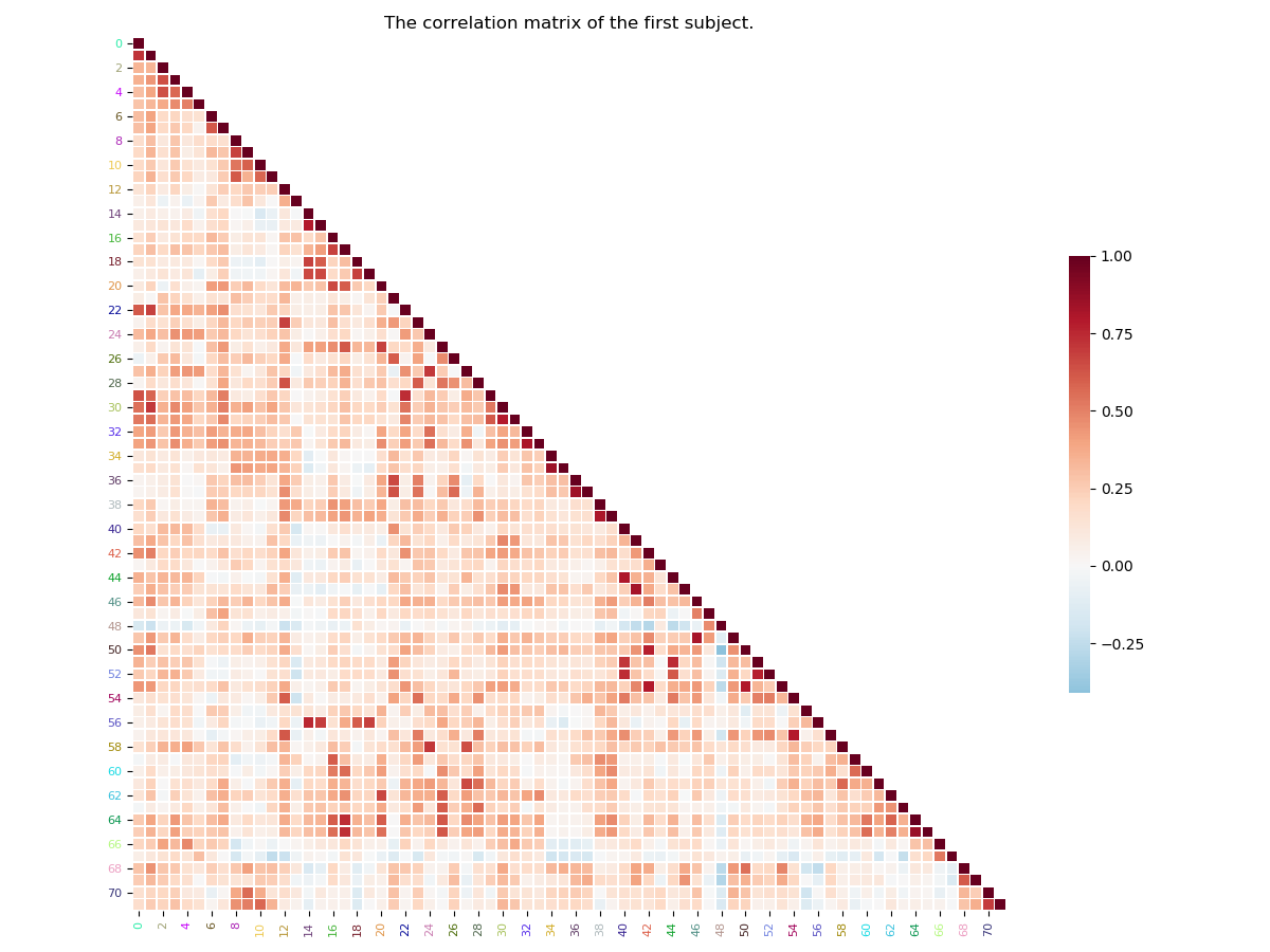
Simple plot of connectivity matrices
We often represent connectivity matrices with a 2D plot, a heatmap, with a colormap that cover the entire range of variation of the connectivity coefficients. It’s a very intuitive way of visualizing those king of matrices. First, we wil plot the entire matrices, without the regions labels/color:
# We will take the correlation matrix of the first
# subject
subject_1_correlation = connectivity_matrices['group_1']['subject_1']['correlation']
plot_matrix(matrix=subject_1_correlation,
            title="The correlation matrix of the first subject.")
plt.show()
Out:
/media/dhaif/Samsung_T5/Work/Programs/ConPagnon/examples/02_Functional_Connectivity/plot_connectivity_matrices.py:120: UserWarning: Matplotlib is currently using agg, which is a non-GUI backend, so cannot show the figure.
  plt.show()
Note
By default, the plot_matrix() function, will only plot
the lower triangle of the matrix, for the simple reason that
by construction, connectivity matrices are symmetric. If you want to plot
the full matrix, you must set the argument mpart to ‘all’.
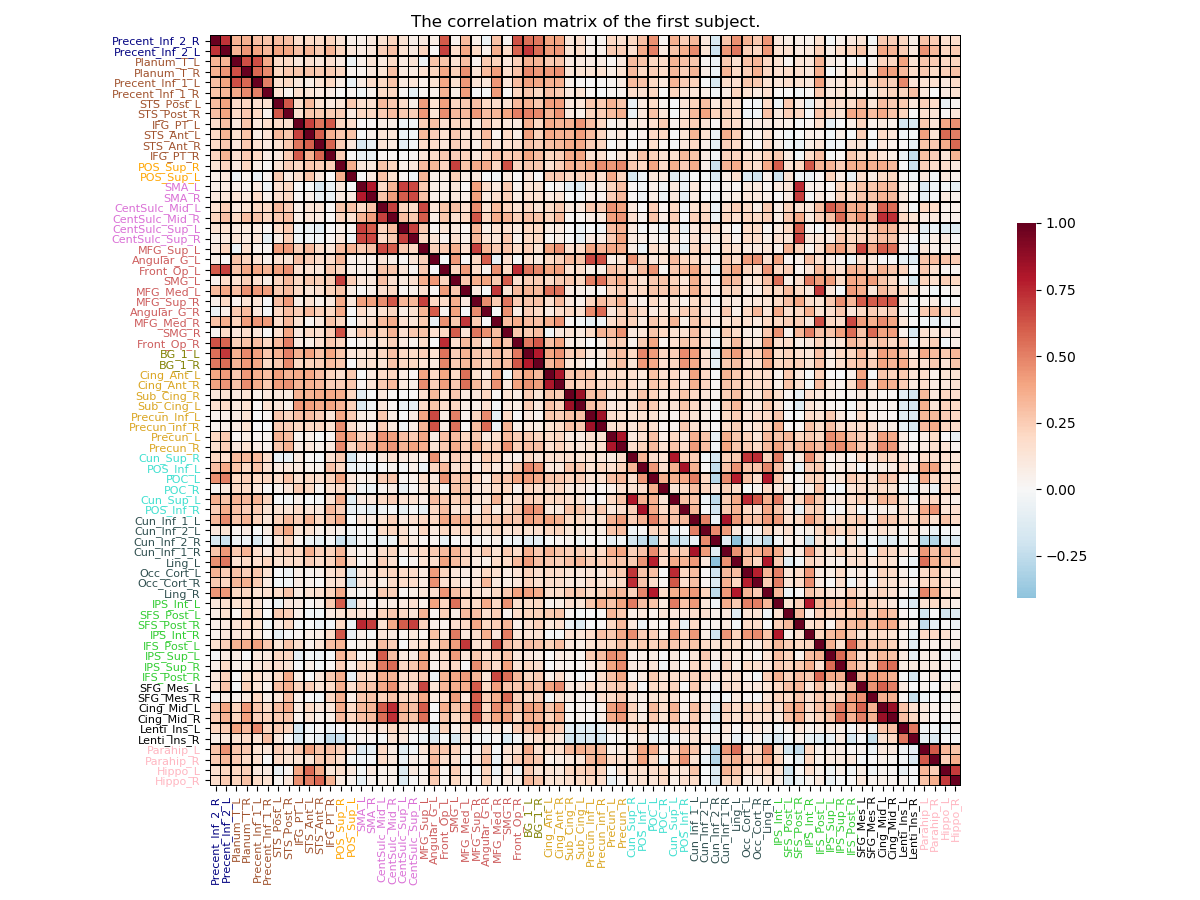
A more complete plot of connectivity matrices
We can add to the previous matrix plot, a little more information. For example we can add the atlas regions labels for the x-axis, and y-axis. We can also color the label with the network colors they are belonging to. In the following example, we will use the atlas used in the first section of this tutorial :
# We load the atlas, attributing a color
# to each network (user defined).

# Fetch the path of the home directory
home_directory = str(Path.home())
# Filename of the atlas file.
atlas_file_name = 'atlas.nii'
# Full path to atlas labels file
atlas_label_file = os.path.join(home_directory, 'atlas_labels.csv')
# Set the colors of the twelves network in the atlas
colors = ['navy', 'sienna', 'orange', 'orchid', 'indianred', 'olive',
          'goldenrod', 'turquoise', 'darkslategray', 'limegreen', 'black',
          'lightpink']
# Number of regions in each of the network
networks = [2, 10, 2, 6, 10, 2, 8, 6, 8, 8, 6, 4]
# We can call fetch_atlas to retrieve useful information about the atlas
atlas_nodes, labels_regions, labels_colors, n_nodes = atlas.fetch_atlas(
    atlas_folder=home_directory,
    atlas_name=atlas_file_name,
    network_regions_number=networks,
    colors_labels=colors,
    labels=atlas_label_file,
    normalize_colors=True)
Now we can call the plot_matrix() function again,
but this time, we will put the atlas label regions, on the
side, and we will color them according to the network.
# Plot of the full correlation matrix for the first subject
plot_matrix(matrix=subject_1_correlation, mpart='all',
            horizontal_labels=labels_regions, vertical_labels=labels_regions,
            labels_colors=labels_colors, linecolor='black', linewidths=.3,
            title="The correlation matrix of the first subject.")
plt.show()
Out:
/media/dhaif/Samsung_T5/Work/Programs/ConPagnon/examples/02_Functional_Connectivity/plot_connectivity_matrices.py:173: UserWarning: Matplotlib is currently using agg, which is a non-GUI backend, so cannot show the figure.
  plt.show()
Save the connectivity matrices dictionary
Finally, you can save the dictionary containing the connectivity matrices to avoid re-computing it, and reuse it easily for your statistical analysis.
# Save the subject connectivity matrices
save_object(object_to_save=connectivity_matrices,
            saving_directory=home_directory,
            filename='subjects_connectivity_matrices.pkl')
Total running time of the script: ( 0 minutes 4.459 seconds)